


 Case study · Hospital website + print
Palmland Hospital: A hospital website patients can actually use.
A growing multi-specialty hospital with 24x7 emergency, dialysis and a large team of consultants needed a website that helps worried patients find the right care quickly, and shows why they can trust it.
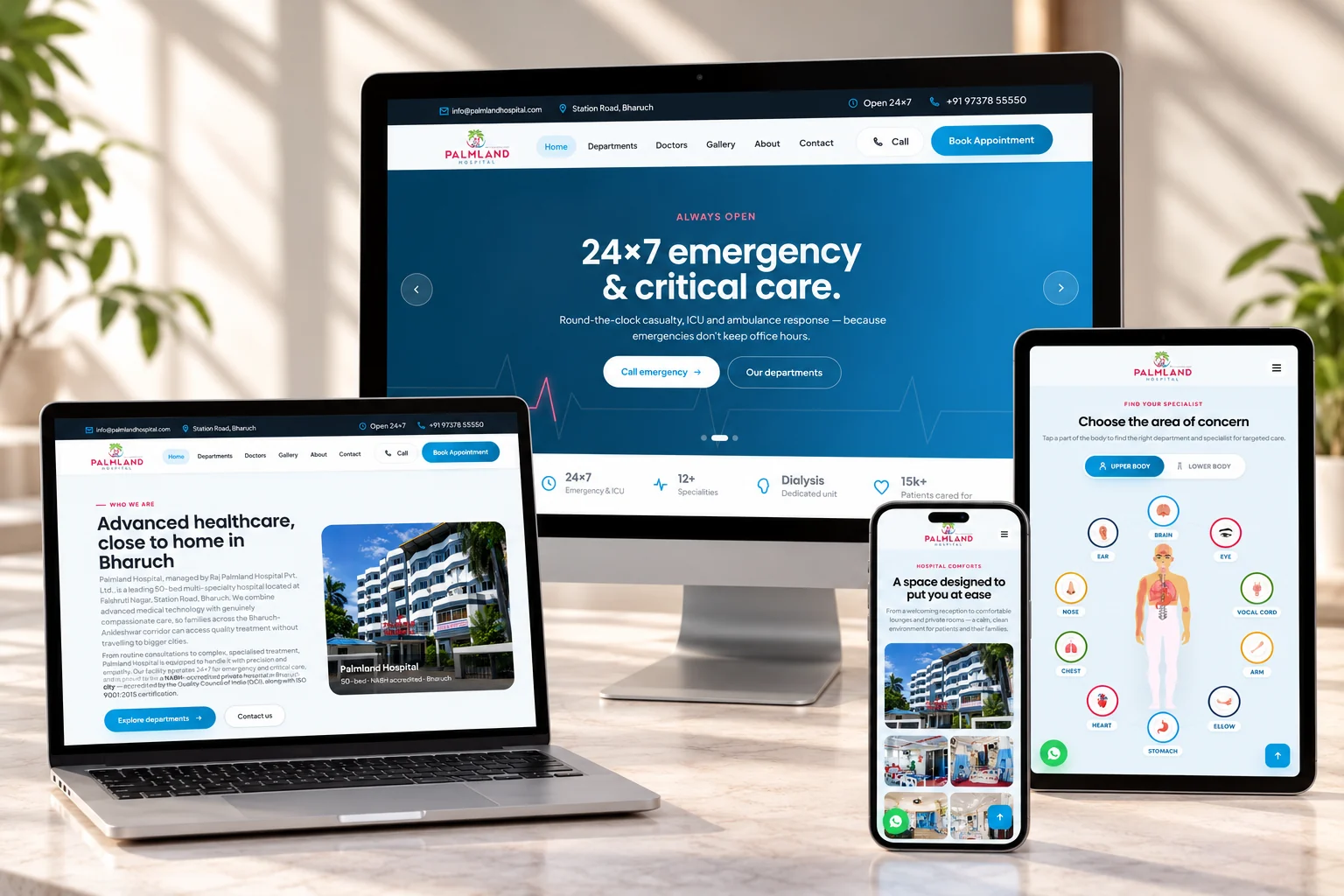
Good care, hard to find.
When someone is unwell, they do not browse. They want to know three things fast: where to go, who will treat them, and whether they can trust the hospital.
A hospital website has to answer those questions for patients who are anxious, often on a phone, and often searching on behalf of a parent or child.
- Patients rarely know the name of a department. They know where it hurts.
- Doctors, qualifications and specialities were hard to find and harder to compare.
- Accreditations and corporate tie-ups, the strongest reasons to trust the hospital, were not visible.
- Booking meant searching for a number. Every extra step lost a patient to the next hospital.
Start from where it hurts.
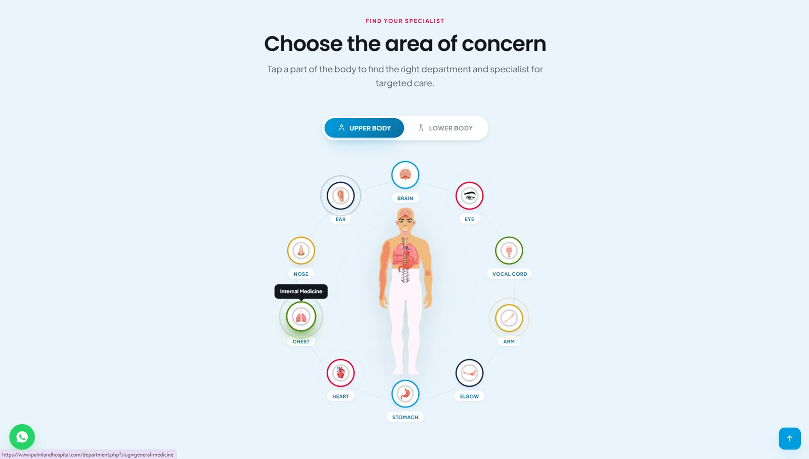
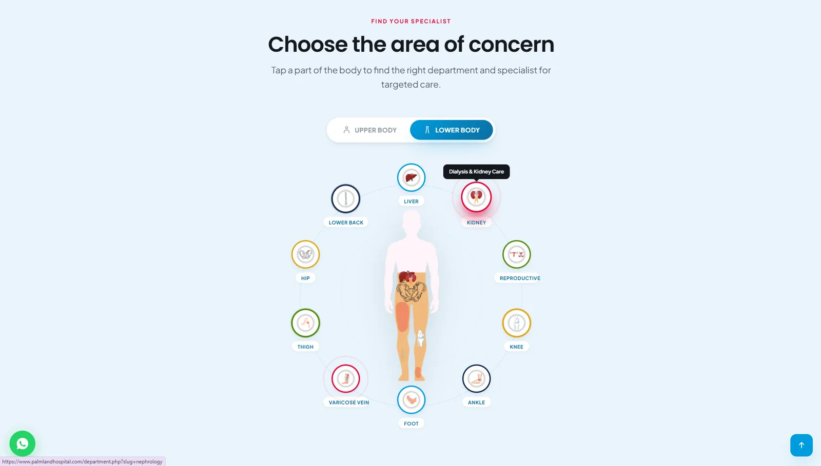
Instead of a list of medical departments, patients tap a part of the body. The site shows the right department and specialist for it.
Six gaps, one patient journey.
-
01
Before“Which department do I need?”
AfterAn interactive body map: tap the chest, knee or kidney and the site points to the right department and specialist. Upper and lower body views, built for phones first.
-
02
BeforeDoctors were hard to find
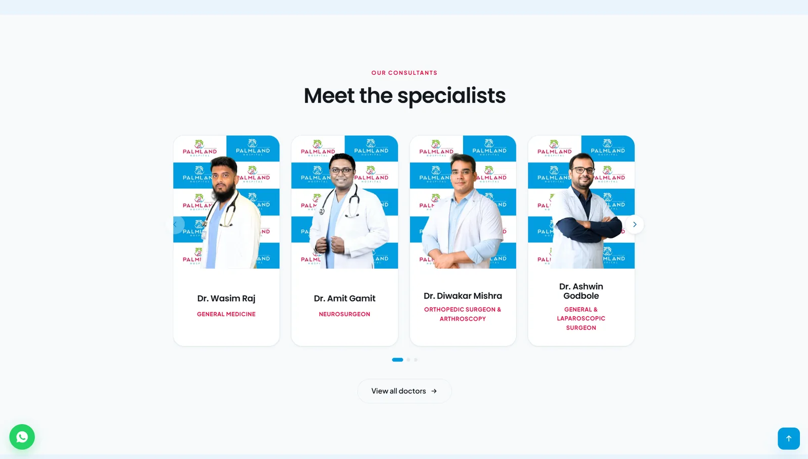
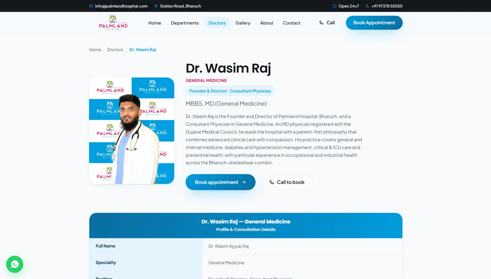
AfterA doctor directory with a profile page for every consultant: photo, speciality, qualifications, role and consultation details, each with its own booking button.
-
03
BeforeTrust was hidden
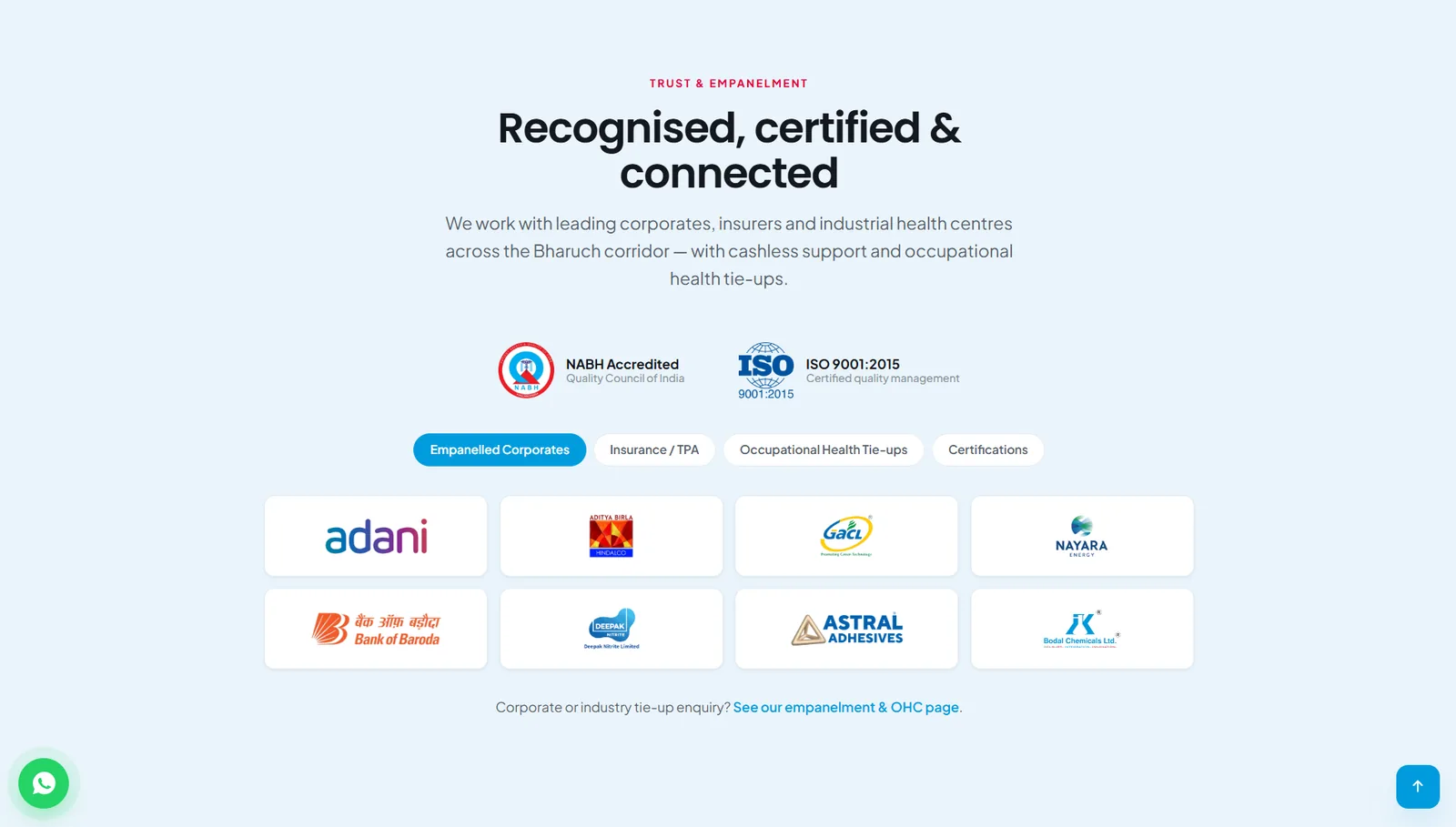
AfterA Trust & Empanelment section up front: NABH accreditation, ISO 9001:2015 and tabs for empanelled corporates, insurance and TPA, and occupational health tie-ups.
-
04
BeforeBooking took too long
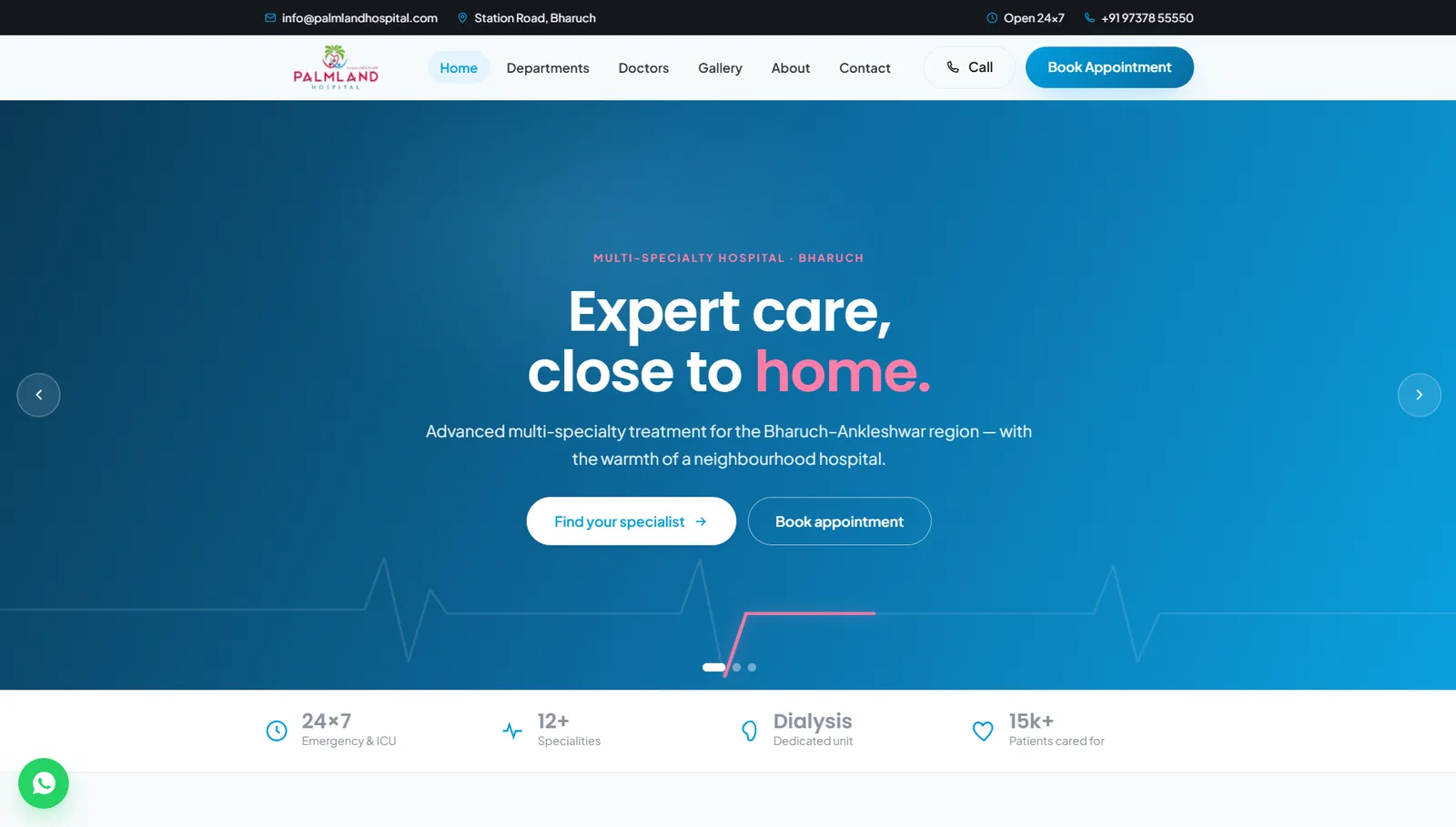
AfterCall, WhatsApp and Book Appointment on every page, with 24x7 emergency and the phone number in the top bar.
-
05
BeforeHard to update
AfterA simple admin so the hospital team can update doctors, departments, health packages and blog posts without calling a developer.
-
06
BeforeOnline and print did not match
AfterA hospital brochure in the same visual language as the website, so patients and corporate partners see one brand everywhere.
Built around the patient.
The same brand at the reception desk.
A hospital brochure with the specialities, accreditations and the “Your Health, Our Priority” promise, designed to match the website so patients and corporate partners see one brand.
Corporate print & catalogues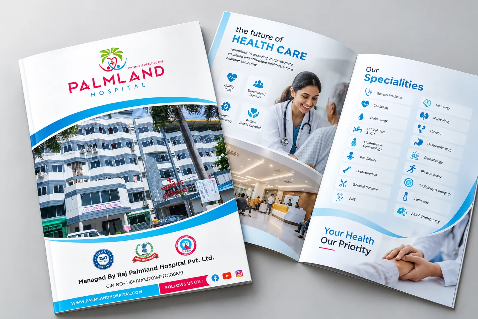
How we got there
-
01
Patient journey
Mapped how real patients search: by symptom, by doctor, or straight to emergency.
-
02
Information
Organised departments, doctors, packages and accreditations so every answer is two taps away.
-
03
Design
A clean, calm medical look in the hospital’s own colours, with large type and clear buttons.
-
04
Build
Fast PHP site with an easy admin, doctor and department pages, SEO and schema.
-
05
Print
A matching brochure for the reception desk, corporate partners and health camps.
A website that helps before the first call.
Patients find the right doctor faster
Starting from the body, not from medical terms, removes the guesswork for patients and their families.
Trust before the first call
Accreditations, empanelments and doctor credentials are visible before a patient picks up the phone.
One brand, online and in print
The website and brochure now speak with the same voice, colours and structure.
Running a hospital or clinic?
We build healthcare websites that help patients find the right doctor and book faster.
